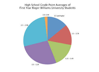
I used statistical information from CollegeBoard about first year Roger Williams Students and their high school GPAs. The first thing I did was put all of the information into a simple chart using Keynote. One column was labeled GPAs, which contained the range of possible GPAs a student could have, and the second column was the percent of students who fit into that GPA range. I also had each row alternating colors to make the information easier to follow when matching the GPA to its percent.

I took the data and, using Keynote again, created a bar graph. I think it did the job, but it just looked like a lot of information and wasn't easy to just look at and process right away.

For the second graph, I did a pie chart. This was much easier to understand than the bar graph. The only problem I had with this was that it had a key off to the side, so the viewer would have to go back and forth between the graph and the key to understand the data.

I improved the pie chart by eliminating the key altogether and labeling the individual sections with the the corresponding GPA label. I also eliminated the percents, because I didn't think it was needed. The viewer can look at the graph and compare the size of the sections to figure out the data without having the exact numbers like a chart.

In the end I think the final graph works really well to display the data. Before this class I would have defaulted to making a bar graph and would have left it at that. Now, I know what works visually and how people understand information when it comes to displaying data like this.
 I took the data and, using Keynote again, created a bar graph. I think it did the job, but it just looked like a lot of information and wasn't easy to just look at and process right away.
 For the second graph, I did a pie chart. This was much easier to understand than the bar graph. The only problem I had with this was that it had a key off to the side, so the viewer would have to go back and forth between the graph and the key to understand the data.
 I improved the pie chart by eliminating the key altogether and labeling the individual sections with the the corresponding GPA label. I also eliminated the percents, because I didn't think it was needed. The viewer can look at the graph and compare the size of the sections to figure out the data without having the exact numbers like a chart.
 In the end I think the final graph works really well to display the data. Before this class I would have defaulted to making a bar graph and would have left it at that. Now, I know what works visually and how people understand information when it comes to displaying data like this.
No comments:
Post a Comment