This assignment required a lot more creativity than others we've done. You had to think about the importance of sequence and how you can use still images to illustrate key ideas in a story. The hardest part for me was trying to link the required pictures for the second storyboard. None of the images really had anything in common, so it was interesting to create a link between them.
This first story only used one of the pictures to create a story with a beginning middle and end. I used the picture of the little girl as the middle, and created the rest of the story around it.
The second story used two of the required images. I used the picture of the boys wearing face masks in a polluted looking area, and the same picture of the little girl. The first past of the story introduces the problem. The image of the boys came second to reinforce the problem. The third image was used to show how the problem in the story was being resolved, and the last image of the little girl illustrated the outcome.
**Both of my stories use scene-to-scene transitions throughout. The stories use only 3-4 panels, and cover longer periods of time. If the stories had been longer, I could have used moment-to-moment or action-to-action transitions to create a more detailed story. Because the ones I created only represent the main ideas over a longer time span, scene-to-scene transitions work better to tell the story.
Overall I thought this was a fun assignment. I tried to pick images and place them so that the viewer could look at them and understand the idea of the story without reading the text word for word. I learned how to pick the main ideas of a story out and simplify with a few images, while still getting the overall point across.
Monday, November 29, 2010
Wednesday, November 17, 2010
Charts and Graphs
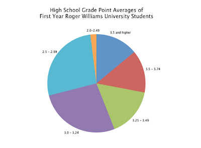
I used statistical information from CollegeBoard about first year Roger Williams Students and their high school GPAs. The first thing I did was put all of the information into a simple chart using Keynote. One column was labeled GPAs, which contained the range of possible GPAs a student could have, and the second column was the percent of students who fit into that GPA range. I also had each row alternating colors to make the information easier to follow when matching the GPA to its percent.
I took the data and, using Keynote again, created a bar graph. I think it did the job, but it just looked like a lot of information and wasn't easy to just look at and process right away.
For the second graph, I did a pie chart. This was much easier to understand than the bar graph. The only problem I had with this was that it had a key off to the side, so the viewer would have to go back and forth between the graph and the key to understand the data.
I improved the pie chart by eliminating the key altogether and labeling the individual sections with the the corresponding GPA label. I also eliminated the percents, because I didn't think it was needed. The viewer can look at the graph and compare the size of the sections to figure out the data without having the exact numbers like a chart.
In the end I think the final graph works really well to display the data. Before this class I would have defaulted to making a bar graph and would have left it at that. Now, I know what works visually and how people understand information when it comes to displaying data like this.
Wednesday, November 10, 2010
Amazon.com Flow Chart
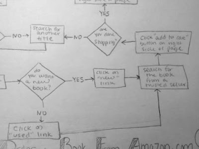
This flow chart is about how to buy a book from Amazon.com. I started out by going to the actual site and writing down my steps as if I were a customer purchasing a book. If I came across a step that required me to answer a yes or no question, like if I was a new or returning customer for example, I wrote down both answers. When I was done writing down all of the steps, I marked them with the appropriate flow chart symbol to make it easier when I began to actually draw. I only used the oval, rectangle and diamond symbols since this process was based on process and decision making. The process was kind of long, because I had to consider all circumstances and cover anything a customer might encounter while buying a book from this site. By doing this assignment, I learned how to connect different parts of a process and reuse some of the steps in order to make the chart clear and easy to follow.
Sunday, November 7, 2010
Visual Essay Diagram: Dual Coding
When I went home one weekend, I searched my house for diagrams or directions that I could improve for my visual essay. My mom had one of those digital photo frames still in the box, which I remember her receiving as a gift a long time ago. She hadn’t used it because there were too many functions and the directions were hard to understand. That was my AHA! moment. Directions are supposed to help someone with a product, and not be too confusing. That was when I decided to improve the manual/diagram of the ULTECH Digital Photo Frame.
This is a picture of the original manual:
When you open it up there are three diagrams. One is for the front, top, bottom, and left side of the frame, the second is for the back of the frame, and the third is for the remote. All of the buttons and parts of the frame are labeled with numbers, and each number corresponds to the names listed on the side. Right then, I knew that needed to be improved because you shouldn't have to search for the names of the parts.
As you flip through the rest of the manual, the functions and parts of the frame are listed with descriptions or directions underneath. There were two problems I had with this. The first is that the directions listed were separated from the diagram, so you had to flip through multiple pages to match a part with its purpose/function. The second problem I found with this was that there seemed to be no rhyme or reason for the order. The order did not correspond with the order of the diagram at all. Other directions that were unrelated to the directions of the labeled diagram were mixed in.
An example of this mess of a manual is regarding directions for one of the buttons. If someone wanted to read about the Play/Enter button, they would flip to page 4. If they wanted to read about the Play/Pause button, they would have to flip 3 pages away to page 7. The diagram, on the other hand says that these two buttons are actually the same one button, labeled Play/Enter&Pause button. Why split everything up?
I started out by jotting ideas down in my sketchbook to fix the problem. My main goal was to recreate the diagram of the main unit (the front/top/bottom/left side), and label all the parts so that they wouldn't be separated. I think the original made the reader take one extra unnecessary step of searching for the name in the list.
I drew the design in Adobe Illustrator, and began working on different versions of integrating and arranging the text. For the first iteration, I labeled all of the parts with numbers like the original. I numbered and put the name of the part (and directions of if it had any) so that it could be read clockwise. I did, however make sure that the labels were near where the actual button was.
I didn't like the first, but it was a good start. For the second, I started to think that maybe the buttons/parts were self explanatory, and didn't instructions. Iteration 2 was more simple, with just the label next to its part.
I didn't think this would work either, however. If the manual had typed directions for some of the functions, then they must be important enough to include. So for my thirds and final iteration, I directly labeled all of the parts, and placed the needed directions below each one. I cleaned everything up and made sure all of the the text was consistent in weight and size. I added the title of the product to complete it.
My first obstacle was trying to minimize the amount of information and text on the page. I edited some of the manual’s original text so it was succinct and made sense. My second obstacle was trying to fit all of the needed information so that it didn't appear too crammed and overwhelming. I played around with spacing and the size of everything to make good use of space.
I learned that best way to integrate text with an image in a diagram is to make sure the words/explanations are in close proximity with the part being labeled. By doing this, understanding the diagram becomes a much easier task.
In the end, I definitely think this diagram is much more effective than the original, unorganized manual. The main unit is now directly labeled with the needed explanations. It reduces the cognitive load for the person trying to operate this digital frame out of the box because they don't have to search for the labels, or flip through pages of unorganized text.
This is a picture of the original manual:
When you open it up there are three diagrams. One is for the front, top, bottom, and left side of the frame, the second is for the back of the frame, and the third is for the remote. All of the buttons and parts of the frame are labeled with numbers, and each number corresponds to the names listed on the side. Right then, I knew that needed to be improved because you shouldn't have to search for the names of the parts.
As you flip through the rest of the manual, the functions and parts of the frame are listed with descriptions or directions underneath. There were two problems I had with this. The first is that the directions listed were separated from the diagram, so you had to flip through multiple pages to match a part with its purpose/function. The second problem I found with this was that there seemed to be no rhyme or reason for the order. The order did not correspond with the order of the diagram at all. Other directions that were unrelated to the directions of the labeled diagram were mixed in.
An example of this mess of a manual is regarding directions for one of the buttons. If someone wanted to read about the Play/Enter button, they would flip to page 4. If they wanted to read about the Play/Pause button, they would have to flip 3 pages away to page 7. The diagram, on the other hand says that these two buttons are actually the same one button, labeled Play/Enter&Pause button. Why split everything up?
I started out by jotting ideas down in my sketchbook to fix the problem. My main goal was to recreate the diagram of the main unit (the front/top/bottom/left side), and label all the parts so that they wouldn't be separated. I think the original made the reader take one extra unnecessary step of searching for the name in the list.
I drew the design in Adobe Illustrator, and began working on different versions of integrating and arranging the text. For the first iteration, I labeled all of the parts with numbers like the original. I numbered and put the name of the part (and directions of if it had any) so that it could be read clockwise. I did, however make sure that the labels were near where the actual button was.
I didn't like the first, but it was a good start. For the second, I started to think that maybe the buttons/parts were self explanatory, and didn't instructions. Iteration 2 was more simple, with just the label next to its part.
I didn't think this would work either, however. If the manual had typed directions for some of the functions, then they must be important enough to include. So for my thirds and final iteration, I directly labeled all of the parts, and placed the needed directions below each one. I cleaned everything up and made sure all of the the text was consistent in weight and size. I added the title of the product to complete it.
My first obstacle was trying to minimize the amount of information and text on the page. I edited some of the manual’s original text so it was succinct and made sense. My second obstacle was trying to fit all of the needed information so that it didn't appear too crammed and overwhelming. I played around with spacing and the size of everything to make good use of space.
I learned that best way to integrate text with an image in a diagram is to make sure the words/explanations are in close proximity with the part being labeled. By doing this, understanding the diagram becomes a much easier task.
In the end, I definitely think this diagram is much more effective than the original, unorganized manual. The main unit is now directly labeled with the needed explanations. It reduces the cognitive load for the person trying to operate this digital frame out of the box because they don't have to search for the labels, or flip through pages of unorganized text.
Monday, November 1, 2010
How to Make a Spaghetti Dinner
It's so hard not to use words, especially when it comes to cooking. There are so many parts of this spaghetti dinner that I wanted to explain, like time and temperature. However, I think that the symbols I used to visually explain this spaghetti dinner How-To effectively communicates the needed steps.
The first thing I did was write out all of the ingredients and directions in words, and then break them down into as few steps as possible. After reworking all of the directions I had, I narrowed everything down to 8 simple steps. I think I learned the most from this initial process. In my head I was brainstorming all of the directions and ingredients needed to make a spaghetti dinner, and it seemed almost impossible break everything down in order to display the least amount of visuals while providing the most amount of information.
After I established the content, I decided to use a flow chart to display the sequence. Each step is contained within the borders of a green box, and the viewer is directed to continue to the next step with a red arrow. This seemed like the easiest way to organize the sequence and allow viewers to visually differentiate between each step. For steps that had multiple elements, I used addition and equal signs. This helped to show what needed to be done, and then what the final result would be for that particular step. I chose to use photographs because I thought the realistic products and directions would help someone cook without words instead of trying to follow my own hand drawn symbols and interpretations.
On the top of the page I included a box for everything needed. The left side is all the food products (some recognizable name brands), and the right is all of the kitchens tools (colander, large pot, etc). I then followed the steps I had written and found images to illustrate each one. The first step was to boil a pot of water. The first box shows a pot being filled with water, plus a heating element on a kitchen stove, which results in hot boiling water. An arrow leads to the next step, which is to place uncooked spaghetti into the boiling water for ten minutes until cooked. The diagram continues on in the same format to show until it comes to the final result; a quick, easy to make spaghetti dish.
Subscribe to:
Posts (Atom)