This final project was a challenge. There were so many topics covered this semester, and condensing all of that into an effective visual took a lot of thought and reflection about the course as a whole.
The first thing our group (Courtney, Dan, and Marcelle) had to consider with this project was the audience. The goal was to present information from this Visual Communication class to other students and viewers who had never taken the class. For us, this meant simplifying the information and providing our knowledge of the course in a way that outsiders could understand.
The next step in developing this project was deciding the design and content. These two aspects went hand in hand because what information we were going to use also depended on how we presented the information. We all agreed that a concept map would be the most effective way to display the content. A Concept Map is a diagram that hierarchically organizes pieces of information and shows the connections and relationships between them. This seemed like the best way to organize and present what we learned.
We worked as a group to identify the content, breaking down what we learned into categories. We started out with VISUAL COMMUNICATION as the primary concept, because our ultimate goal was to define and explain visual communication. Branched off of this were more focused concepts that included science, design, aesthetics, and visualizations. We thought that these three categories were larger ideas in the course. From there we broke the information down further, becoming more and more specific as we branched out. We covered a majority of the course’s content using no more than two words for each concept. The connections and minimized amount of text makes everything easy for viewers to read and understand the connections.
Our first iteration was a sketch of a 2D concept map that helped us to get all of our ideas out onto paper. For the final iteration, we decided to take it a step further by bringing the concept map into a 3D space.
The first idea was to use Styrofoam balls in varying sizes connected by wooden skewers. We planned on printing the labels on different colored paper to further distinguish the concepts’ order and emphasis. The problem with this design? Styrofoam is SO expensive. With the number of Styrofoam balls we needed for this project, the cost would have been upwards of $50. We took advantage of the Christmas season by replacing the Styrofoam and skewers with ornaments and ribbon. Round ornaments in different size and colors were purchased to mount on a large foam board. The center ornament was the largest. As the map branched out, the ornaments changed color and became increasingly smaller as the ideas became more specific. We stuck to the four color rule, using only green, gold, silver, and red in an attempt to reduce the viewers cognitive load. Black ribbon was glued onto the board to connect the ornaments. The ribbon also became increasingly thinner as the map branched, another visual element that added to the order of the map with size and color.
The end result was a very organized, effective visualization. We worked together to take content in a 2D format and bring it to life in a more colorful, dimensional way.
Personal Reflection:
Overall, I think the project came out great. This was an interesting because we were essentially using all the concepts, ideas, and theories we learned about visual communication to present that same information. It was very helpful working in a group because we all really put our heads together to bounce ideas off each other and brainstorm. Everyone had helpful contributions, and I know the ideas we used were the result of teamwork. A lot of time and hard work went into putting this project together, and I think the effort and creativity really shows. Coming across the prices of Styrofoam was a huge struggle because I had to think on my feet when shopping for materials. Our group had decided on doing a concept map, so I really had to think on my feet and figure out a way to keep the same idea while not spending a lot of money. Thanks to the Dollar Tree, I was able to keep to the same project design and use ornaments. In the end, I think this worked out even better because we were able to use the size and distinguishable colors of the ornaments to visually organize all of our information.
Way VisComm 165
Monday, December 13, 2010
Monday, December 6, 2010
Multivariate Display
For me, this was the most difficult and challenging visual we've done all semester. I used my pie chart from the original simple graph I did earlier, which displayed data for the high school GPA of first year RWU students. I had a lot of trouble thinking of what "story" to tell with this information as I searched for two other sets of data to use in the multivariate. I finally decided to make the entire visual about first year RWU students. I used data about graduating class rank as well as student location (in-state or out of state).
It was really difficult trying to make a multivariate graph with a pie chart. I couldn't think of any way to display all of this data. I wasn't showing information over time, so that eliminated a lot of possibilities for using different graphs. The data was very different from each other and didn't have the same variables, so it was really confusing trying to tie everything together. I'm still not even sure if the visuals I made even work as a multivariate display.
Even though I was unsure, I started with making a pie chart for class rank. The data given from collegeboard.com said that 14% of students were in the top 10th of the graduating class, 38% were in the top quarter, and 72% were in the top half. I plugged in the numbers to make a graph, not even realizing at first that the numbers didn't add up to 100%. After working with the numbers, I realized that I had to do some math to make everything add up. There was 14% in the top tenth, which I subtracted from the 38% in the top quarter (because if you're in the top tenth, then you are also in the top quarter) to get 24%. I then subtracted the 24% from the 72% in the top half of the class (because, again, if you're in the top quarter, you are also in the top half). This left me with 90%. I concluded that the remaining 10% were students in the bottom half of the class.
The third data set was much simpler. 91% of first year students were out of state, while 9% were in-state.
For my first graph, I tried overlapping information. In my head it seemed like a great idea, but it ended up being a confusing visual disaster, in my opinion. I started with the original colorful pie chart. I then took the class rank pie chart and filled each slice with a different pattern. The pattern was transparent, so you could still see the colored chart underneath. The last chart was much simpler, with only two pieces of data, so I created a border around the entire graph. It was really busy and the patterns made it difficult to understand the chart underneath. I had to use keys for everything, because overlapping made it hard to label everything directly.
It took me forever to figure out another solution. My AHA! moment was to make everything 3-D. I made the 3 pie charts 3 dimensional and had them somewhat stacked. However, I wanted to label everything, so the graphs are more spread out than I originally thought. This display is much easier to understand because everything is color coded and the viewer can understand the information much quicker.
In the end I was happier with the second display, which has all the elements I was hoping to include. It has three variables that tell a story about first year RWU students in a visual way. It may not be the best example of a multivariate display, but I learned a lot through the problem solving I had to do to get to my end result.
It was really difficult trying to make a multivariate graph with a pie chart. I couldn't think of any way to display all of this data. I wasn't showing information over time, so that eliminated a lot of possibilities for using different graphs. The data was very different from each other and didn't have the same variables, so it was really confusing trying to tie everything together. I'm still not even sure if the visuals I made even work as a multivariate display.
Even though I was unsure, I started with making a pie chart for class rank. The data given from collegeboard.com said that 14% of students were in the top 10th of the graduating class, 38% were in the top quarter, and 72% were in the top half. I plugged in the numbers to make a graph, not even realizing at first that the numbers didn't add up to 100%. After working with the numbers, I realized that I had to do some math to make everything add up. There was 14% in the top tenth, which I subtracted from the 38% in the top quarter (because if you're in the top tenth, then you are also in the top quarter) to get 24%. I then subtracted the 24% from the 72% in the top half of the class (because, again, if you're in the top quarter, you are also in the top half). This left me with 90%. I concluded that the remaining 10% were students in the bottom half of the class.
The third data set was much simpler. 91% of first year students were out of state, while 9% were in-state.
For my first graph, I tried overlapping information. In my head it seemed like a great idea, but it ended up being a confusing visual disaster, in my opinion. I started with the original colorful pie chart. I then took the class rank pie chart and filled each slice with a different pattern. The pattern was transparent, so you could still see the colored chart underneath. The last chart was much simpler, with only two pieces of data, so I created a border around the entire graph. It was really busy and the patterns made it difficult to understand the chart underneath. I had to use keys for everything, because overlapping made it hard to label everything directly.
It took me forever to figure out another solution. My AHA! moment was to make everything 3-D. I made the 3 pie charts 3 dimensional and had them somewhat stacked. However, I wanted to label everything, so the graphs are more spread out than I originally thought. This display is much easier to understand because everything is color coded and the viewer can understand the information much quicker.
In the end I was happier with the second display, which has all the elements I was hoping to include. It has three variables that tell a story about first year RWU students in a visual way. It may not be the best example of a multivariate display, but I learned a lot through the problem solving I had to do to get to my end result.
Monday, November 29, 2010
Storyboards
This assignment required a lot more creativity than others we've done. You had to think about the importance of sequence and how you can use still images to illustrate key ideas in a story. The hardest part for me was trying to link the required pictures for the second storyboard. None of the images really had anything in common, so it was interesting to create a link between them.
This first story only used one of the pictures to create a story with a beginning middle and end. I used the picture of the little girl as the middle, and created the rest of the story around it.
The second story used two of the required images. I used the picture of the boys wearing face masks in a polluted looking area, and the same picture of the little girl. The first past of the story introduces the problem. The image of the boys came second to reinforce the problem. The third image was used to show how the problem in the story was being resolved, and the last image of the little girl illustrated the outcome.
**Both of my stories use scene-to-scene transitions throughout. The stories use only 3-4 panels, and cover longer periods of time. If the stories had been longer, I could have used moment-to-moment or action-to-action transitions to create a more detailed story. Because the ones I created only represent the main ideas over a longer time span, scene-to-scene transitions work better to tell the story.
Overall I thought this was a fun assignment. I tried to pick images and place them so that the viewer could look at them and understand the idea of the story without reading the text word for word. I learned how to pick the main ideas of a story out and simplify with a few images, while still getting the overall point across.
Wednesday, November 17, 2010
Charts and Graphs
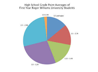
I used statistical information from CollegeBoard about first year Roger Williams Students and their high school GPAs. The first thing I did was put all of the information into a simple chart using Keynote. One column was labeled GPAs, which contained the range of possible GPAs a student could have, and the second column was the percent of students who fit into that GPA range. I also had each row alternating colors to make the information easier to follow when matching the GPA to its percent.
I took the data and, using Keynote again, created a bar graph. I think it did the job, but it just looked like a lot of information and wasn't easy to just look at and process right away.
For the second graph, I did a pie chart. This was much easier to understand than the bar graph. The only problem I had with this was that it had a key off to the side, so the viewer would have to go back and forth between the graph and the key to understand the data.
I improved the pie chart by eliminating the key altogether and labeling the individual sections with the the corresponding GPA label. I also eliminated the percents, because I didn't think it was needed. The viewer can look at the graph and compare the size of the sections to figure out the data without having the exact numbers like a chart.
In the end I think the final graph works really well to display the data. Before this class I would have defaulted to making a bar graph and would have left it at that. Now, I know what works visually and how people understand information when it comes to displaying data like this.
Wednesday, November 10, 2010
Amazon.com Flow Chart
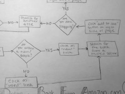
This flow chart is about how to buy a book from Amazon.com. I started out by going to the actual site and writing down my steps as if I were a customer purchasing a book. If I came across a step that required me to answer a yes or no question, like if I was a new or returning customer for example, I wrote down both answers. When I was done writing down all of the steps, I marked them with the appropriate flow chart symbol to make it easier when I began to actually draw. I only used the oval, rectangle and diamond symbols since this process was based on process and decision making. The process was kind of long, because I had to consider all circumstances and cover anything a customer might encounter while buying a book from this site. By doing this assignment, I learned how to connect different parts of a process and reuse some of the steps in order to make the chart clear and easy to follow.
Sunday, November 7, 2010
Visual Essay Diagram: Dual Coding
When I went home one weekend, I searched my house for diagrams or directions that I could improve for my visual essay. My mom had one of those digital photo frames still in the box, which I remember her receiving as a gift a long time ago. She hadn’t used it because there were too many functions and the directions were hard to understand. That was my AHA! moment. Directions are supposed to help someone with a product, and not be too confusing. That was when I decided to improve the manual/diagram of the ULTECH Digital Photo Frame.
This is a picture of the original manual:
When you open it up there are three diagrams. One is for the front, top, bottom, and left side of the frame, the second is for the back of the frame, and the third is for the remote. All of the buttons and parts of the frame are labeled with numbers, and each number corresponds to the names listed on the side. Right then, I knew that needed to be improved because you shouldn't have to search for the names of the parts.
As you flip through the rest of the manual, the functions and parts of the frame are listed with descriptions or directions underneath. There were two problems I had with this. The first is that the directions listed were separated from the diagram, so you had to flip through multiple pages to match a part with its purpose/function. The second problem I found with this was that there seemed to be no rhyme or reason for the order. The order did not correspond with the order of the diagram at all. Other directions that were unrelated to the directions of the labeled diagram were mixed in.
An example of this mess of a manual is regarding directions for one of the buttons. If someone wanted to read about the Play/Enter button, they would flip to page 4. If they wanted to read about the Play/Pause button, they would have to flip 3 pages away to page 7. The diagram, on the other hand says that these two buttons are actually the same one button, labeled Play/Enter&Pause button. Why split everything up?
I started out by jotting ideas down in my sketchbook to fix the problem. My main goal was to recreate the diagram of the main unit (the front/top/bottom/left side), and label all the parts so that they wouldn't be separated. I think the original made the reader take one extra unnecessary step of searching for the name in the list.
I drew the design in Adobe Illustrator, and began working on different versions of integrating and arranging the text. For the first iteration, I labeled all of the parts with numbers like the original. I numbered and put the name of the part (and directions of if it had any) so that it could be read clockwise. I did, however make sure that the labels were near where the actual button was.
I didn't like the first, but it was a good start. For the second, I started to think that maybe the buttons/parts were self explanatory, and didn't instructions. Iteration 2 was more simple, with just the label next to its part.
I didn't think this would work either, however. If the manual had typed directions for some of the functions, then they must be important enough to include. So for my thirds and final iteration, I directly labeled all of the parts, and placed the needed directions below each one. I cleaned everything up and made sure all of the the text was consistent in weight and size. I added the title of the product to complete it.
My first obstacle was trying to minimize the amount of information and text on the page. I edited some of the manual’s original text so it was succinct and made sense. My second obstacle was trying to fit all of the needed information so that it didn't appear too crammed and overwhelming. I played around with spacing and the size of everything to make good use of space.
I learned that best way to integrate text with an image in a diagram is to make sure the words/explanations are in close proximity with the part being labeled. By doing this, understanding the diagram becomes a much easier task.
In the end, I definitely think this diagram is much more effective than the original, unorganized manual. The main unit is now directly labeled with the needed explanations. It reduces the cognitive load for the person trying to operate this digital frame out of the box because they don't have to search for the labels, or flip through pages of unorganized text.
Monday, November 1, 2010
How to Make a Spaghetti Dinner
It's so hard not to use words, especially when it comes to cooking. There are so many parts of this spaghetti dinner that I wanted to explain, like time and temperature. However, I think that the symbols I used to visually explain this spaghetti dinner How-To effectively communicates the needed steps.
The first thing I did was write out all of the ingredients and directions in words, and then break them down into as few steps as possible. After reworking all of the directions I had, I narrowed everything down to 8 simple steps. I think I learned the most from this initial process. In my head I was brainstorming all of the directions and ingredients needed to make a spaghetti dinner, and it seemed almost impossible break everything down in order to display the least amount of visuals while providing the most amount of information.
After I established the content, I decided to use a flow chart to display the sequence. Each step is contained within the borders of a green box, and the viewer is directed to continue to the next step with a red arrow. This seemed like the easiest way to organize the sequence and allow viewers to visually differentiate between each step. For steps that had multiple elements, I used addition and equal signs. This helped to show what needed to be done, and then what the final result would be for that particular step. I chose to use photographs because I thought the realistic products and directions would help someone cook without words instead of trying to follow my own hand drawn symbols and interpretations.
On the top of the page I included a box for everything needed. The left side is all the food products (some recognizable name brands), and the right is all of the kitchens tools (colander, large pot, etc). I then followed the steps I had written and found images to illustrate each one. The first step was to boil a pot of water. The first box shows a pot being filled with water, plus a heating element on a kitchen stove, which results in hot boiling water. An arrow leads to the next step, which is to place uncooked spaghetti into the boiling water for ten minutes until cooked. The diagram continues on in the same format to show until it comes to the final result; a quick, easy to make spaghetti dish.
Sunday, October 31, 2010
Lawncare Problem Solving
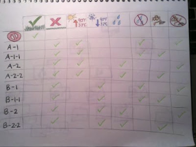
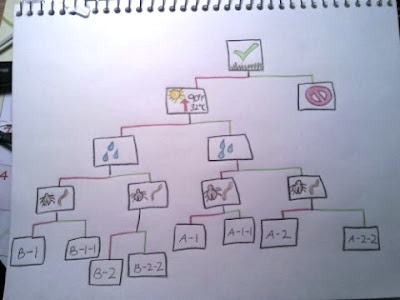
This fertilizer packaging problem definitely took more thought than the previous maps I've done so far. The hardest parts for me were keeping everything to a minimum while still providing all of the information, and also keeping everything organized so it could be easily understood. After a lot of sketching and brainstorming, I came up with two maps that both have their pros and cons.
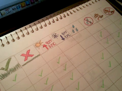
This first is a chart to organize the information. My inspiration for this is the charts that websites use to compare and contrast similar products. These charts show each item, and then check off all of the features each has. In this case, the products are the fertilizer types (A-1, B-2, etc) and the features are the conditions needed for each fertilizer (temperature, pests, etc). The symbols I used are easy to understand, so it is easy for customers to look at the chart and see what each fertilizer type requires based on the number of check marks.
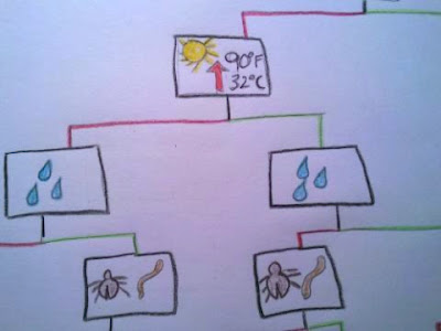
When I was finished with this map, it made sense, but I started to wonder if it was necessary to include every single condition. The conditions were all opposites; healthy or not healthy, above 90 degrees or below 90 degrees, wet or dry, pests or no pests. I then made a map that used only one of each condition, and I still used the same symbols as the first chart. The map looked very similar to the decision tree we made in class, but used green lines for yes and red lines for no instead of words. This map seemed less cluttered with unneeded information, providing fewer visuals than the first but still with the same information. It starts with a symbol for a healthy lawn, and the customer would either agree or disagree to lead to the next condition. The next was temperature, so they would either agree that it was above 90 degrees or it wasn't. It continues all the way down until it reaches the conclusion of each fertilizer type.
I think both of these options are much more effective than the original wordy packaging because they use easily understood visuals and organization to convey a message. The first works really well because of its organization, while the second uses less visual information to come to the same conclusion.
Sunday, October 3, 2010
Rapid Collage
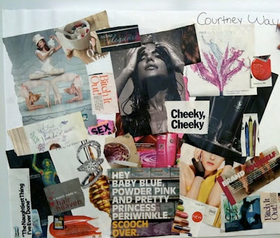
MY OBSERVATIONS
- theme of femininity
- bold and eye catching text
- use of mainly warm colors; reds, yellows, oranges, pinks
- a lot of white used in images/words
- entire use of paper; overlapping, no negative space between images
- all the overlapping images have hard edges
- images not all positioned one way; some horizontal, some vertical, some tilted
It was interesting to compare my observations to my comments. Everyone agreed that women, femininity, and female beauty products was the overall theme. Someone had also mentioned the use of bold words with provocative meaning, which is exactly why they caught my eye when I was flipping through magazines. The most interesting observation from my comments that I didn't notice was that all the women in the collage aren't looking straight at the camera and are glancing elsewhere. In one image, where the woman would have been looking straight at you, I covered her eyes with an overlapping picture. None of it was intentional, but it's cool that it ended up being a pattern.
Wednesday, September 29, 2010
Concept Map
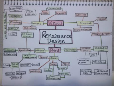
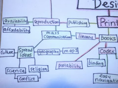
At first I had trouble thinking of a topic for the main focus of my concept map. I thought of some ideas, but they didn't seem big enough to really develop. I started thinking about school related topics, making a concept map about a concept map, and other general stuff that seemed pointless to me. I put my sketchbook aside and started to study for a test when (AHA!) I came up with my topic. The test I have tomorrow has so much information, so I decided to organize my notes into a concept map I can use as a study guide.
My test in the History of Graphic Design is covering a lot of info, which would result in a map with infinite branches. Because of this, I decided to focus on the specific topic of Renaissance Design. I broke down this narrowed topic into two branches, Visual and Print. From there everything fell into place, and as I studied, I added to the map. I kept breaking everything down and became more specific. Because I was only using one or two words, it simplified everything and made the content easier to understand than my notes.
Its hard for me to position the different boxes on a map when I first start since I never know how far something will branch out or if I'll have enough room. I don't know why, but I have a problem with just drawing in pen or drawing a whole section of a map if I don't know what it will look like. I jotted everything down in my sketchbook as I studied and referred to it as I created my final map. This one was color coded to further organize it. The red boxes are the two main branches off of the central topic, the yellow are the main subtopics, green are the details, and the boxes left white are even smaller details. Colors made it less confusing and allowed me to determine importance.
In the end it was really interesting to see how different things connected and affected each other, which really helped me study and understand. I have a lot more studying to do but this map helped me to fully grasp this topic for the test, so I definitely think its a great study tool in the future.
Subscribe to:
Posts (Atom)