This first is a chart to organize the information. My inspiration for this is the charts that websites use to compare and contrast similar products. These charts show each item, and then check off all of the features each has. In this case, the products are the fertilizer types (A-1, B-2, etc) and the features are the conditions needed for each fertilizer (temperature, pests, etc). The symbols I used are easy to understand, so it is easy for customers to look at the chart and see what each fertilizer type requires based on the number of check marks.
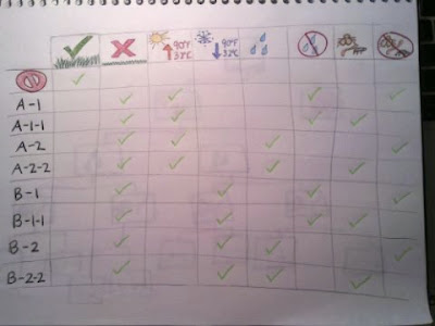
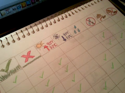
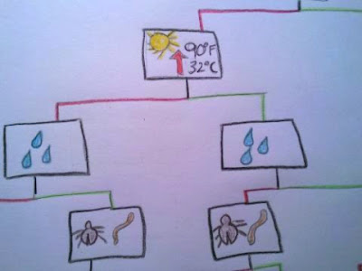
When I was finished with this map, it made sense, but I started to wonder if it was necessary to include every single condition. The conditions were all opposites; healthy or not healthy, above 90 degrees or below 90 degrees, wet or dry, pests or no pests. I then made a map that used only one of each condition, and I still used the same symbols as the first chart. The map looked very similar to the decision tree we made in class, but used green lines for yes and red lines for no instead of words. This map seemed less cluttered with unneeded information, providing fewer visuals than the first but still with the same information. It starts with a symbol for a healthy lawn, and the customer would either agree or disagree to lead to the next condition. The next was temperature, so they would either agree that it was above 90 degrees or it wasn't. It continues all the way down until it reaches the conclusion of each fertilizer type.
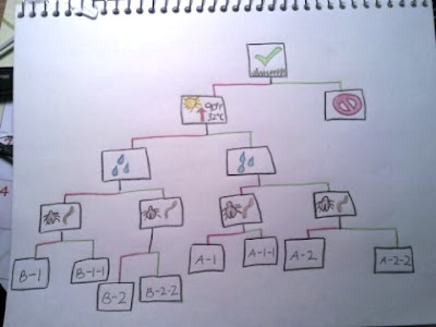
 I think both of these options are much more effective than the original wordy packaging because they use easily understood visuals and organization to convey a message. The first works really well because of its organization, while the second uses less visual information to come to the same conclusion.
