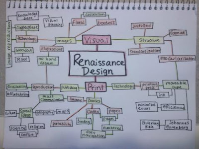
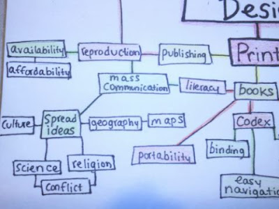
My test in the History of Graphic Design is covering a lot of info, which would result in a map with infinite branches. Because of this, I decided to focus on the specific topic of Renaissance Design. I broke down this narrowed topic into two branches, Visual and Print. From there everything fell into place, and as I studied, I added to the map. I kept breaking everything down and became more specific. Because I was only using one or two words, it simplified everything and made the content easier to understand than my notes.
 Its hard for me to position the different boxes on a map when I first start since I never know how far something will branch out or if I'll have enough room. I don't know why, but I have a problem with just drawing in pen or drawing a whole section of a map if I don't know what it will look like. I jotted everything down in my sketchbook as I studied and referred to it as I created my final map. This one was color coded to further organize it. The red boxes are the two main branches off of the central topic, the yellow are the main subtopics, green are the details, and the boxes left white are even smaller details. Colors made it less confusing and allowed me to determine importance.
In the end it was really interesting to see how different things connected and affected each other, which really helped me study and understand. I have a lot more studying to do but this map helped me to fully grasp this topic for the test, so I definitely think its a great study tool in the future.

